The mod you are trying to view has ceased development and consequently been archived. If you are a member of this mod, can demonstrate that it is being actively developed and will be able to keep this profile up to date with the latest news, images, videos and downloads, please contact us with all details and we will consider its re-activation.
Half-Life 2: Retaliation is a singleplayer Half-Life 2: Episode Two modification. It brings you into the familiar world of Half-Life 2 just as the antlion invasion of Nova Prospekt takes place. You step into the shoes of a notorious Rebel soldier who has been held captive in Nova Prospekt for months. During the invasion, he escapes his prison cell and goes on a long and violent mission to retaliate against the Combine, and aid the Resistance in the revolution. Travel through brand-new areas in Nova Prospekt, fight your way through three never-before-seen locations in the Half-Life 2 universe, witness the beginning of The Uprising, and ultimately carry out your retaliation.

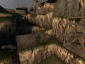
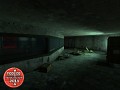
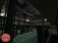
Just photos of the improved d2_inland_01. Changes include the addition of telephone poles, wires, the bridge with a derelict train, the old cars, and more detail to the hillside.
Look's good, I'm assuming its a WIP, yes?
Needs improvements in general, keep up the good work.
Nope, this is basically close to a final product. I don't have plans to improve this map anymore, but if one of my designers wants to, we'll see what improvements can be made.
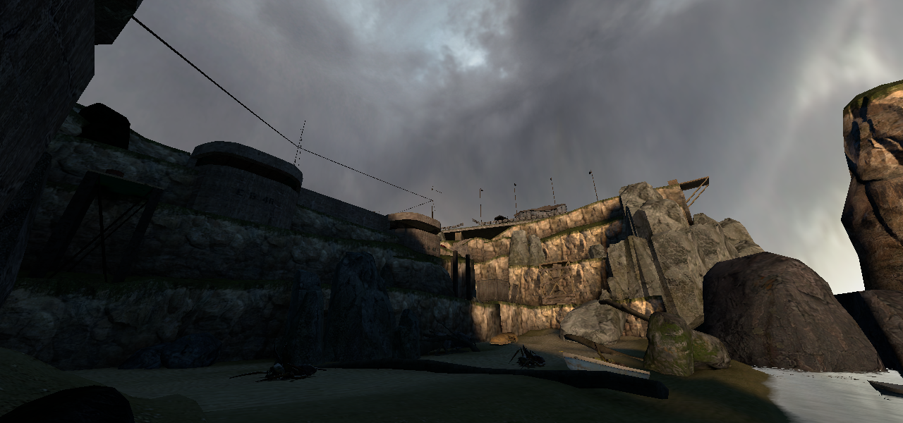
This is the final? Very lacking in detail, looks like it could be thrown together in 2 hours.
Took us a while to get this(weeks), and to be honest, it looks rather good in-game.
I would have to agree, even from here it looks really good so in game it will look much better, not to mention this is being looked at from only one angle.
-Read below comment by me :D
It looks a little dark on the left side of the image, maybe some extra lights there might help but the level design looks pretty good.
yes, it does look indeed very good!
not always needs everything to be full of detail.
and, there is enough detail already in this mappart!
the left side of the map is indeed a bi dark, on screen.
but its hard to say that this will also be the case in real
game mode, have to play it for that. you always could add
a light there somewhere, but really necessary it isn't, for
as far as i now can see.
and making this in 2 hours can indeed be done, but only when you already know where everything will be placed. and even then 2 hours
will be quit hard to stay in. no, don't worry, its great.
you always will get complains like that...
leon
Piedoom says this on his page;
For those of you who don't know me, I'm evil. If I happen to stumble upon your game page I will criticize the hay out of you!
so i wouldn't worry to much about him, lol.
seems to be a hobby of him to do so,....
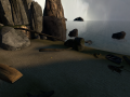
I give Joker my honest opinion. If you notice on other pictures, I actually have the ability to compliment. I stand by my opinion - his map designers just seem to leave out detail in general.
Let me go into detail, then on what I disliked and what I liked-
Pros:
-Neat design
-Lighting is great (as it always is)
-Nice... Rocks? hehe.
-I thought the cliffsides were detailed
Cons:
-I didn't care for the bareness of the beach, adding some decals or overlays would be nice? But you might be better off listening to SPY's opinion, as he is much better at these things than I.
-The map just kind of awkwardly cuts off to the right behind the rocks, maybe put something in the mid ground just as a transition?
And I have to apologize, I certainly have been giving you ALOT of criticisms, but have been lacking on the compliments. Will make sure to point out the stuff I like as well rather than just the things to work on, as well as why I might not like certain things.
looks good!
but the rooks to the right (the grey ones before the wooden plank goes out into the air) are much too cuboid/blocky
I'm fairly certain that those are stock HL2 models.